DC Comics is doing a complete overhaul of their comics line, primarily to bring attention to their new “digital initiative,” which means focusing a lot more on bringing comics to your iPad. As part of that, they are relaunching and rebranding 52 titles next month. They just released their new logo designs. Let’s take a look:

Compare and contrast: Look at the classic logos that are essentially unchanged (Superman, Action, Swamp Thing) and compare them to the new ones; which are new classics and which are slaves to fads? Hint: The ones that are overly cluttered, or are too dependent on the overdone and horribly-dated “distressed” look (reminiscent of acid-wash jeans, frankly) are not the new classics.
My opinions, in order:
ACTION: It’s good that they had the sense to leave this one alone. It’s fine. Grade: A
ALL-STAR WESTERN: Feels a little “clip art” to me; basically what you’d get if you went to Kinko’s and asked for a western-themed logo. The distressed stuff doesn’t help, and neither does the 1989 distortion. Grade: D
ANIMAL MAN: Structurally okay, but I would prefer it in a color. Hopefully they will vary that depending on the cover art. Grade: B
AQUAMAN: Here’s a tip: if you have a logo that’s already typography, USE IT! Why hide the classic Aquaman “A” logo behind the generic typeface? Build the masthead around the existing logo. Duh. Grade: D-
BATGIRL: It’s okay. I’d like the bat to be a little stronger, but it goes with the rest of the family. Grade: B-
BATMAN: Ditto. Grade: B-
BLUE BEETLE: Very nice. Clean and crisp and evocative of the character. A+
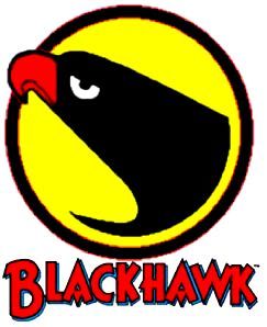
BLACKHAWKS: Terrible. Too fussy, terrible typography, and it looks like the bird is wearing lipstick. Aside from not looking like a hawk. Why not do something with the classic Blackhawks emblem or some variation of it? Grade: F
BATMAN & ROBIN: One of the better looking Bat logos. B+
BATMAN THE DARK KNIGHT: Best of the Bat logos. Grade: A
BATWING: Generally okay, but the texture on the lettering seems extraneous to me. Grade: B-
BATWOMAN: Enh. The distortion on the B and N seems arbitrary and without purpose. It tends to make the “ATWOMA” read as a separate word. And the B reads as a G. GATWOMAN? Grade: C
CATWOMAN: Perfunctory and feels like the movie logo. Not a bad design, but not very interesting either. Grade: C
CAPTAIN ATOM: Very good typography and use of the atom symbol, but the glow effect seems unnecessary and overdone. Grade: B-
BIRDS OF PREY: Very good design…. for a 1967 war movie. Terribly dated and static. The hook on the B is clearly meant to denote a beak, but what’s the hook at the bottom of the P? Grade: D
DEATHSTROKE: Looks like something from the boys’ t-shirt department at Target. Not at all evocative of the character; Slade Wilson is an elegant and sophisticated hired assassin, not a grungy mercenary. Grade: F
DETECTIVE: Very good use of the Bat image, but the typography is dull. Grade: C-
DEMON KNIGHTS: Competent, but generic. Unfortunate quasi-ligature tangent between the N in Demon and T in Knights, making a weird pseudo-letter. Grade: B-
THE FLASH: No. The Flash is a bolt of human lightning, a blur of red and gold. Static black block lettering, even at an angle, doesn’t sell it. Grade: C-
FRANKENSTEIN, AGENT OF SHADE: Pretty good, but nothing special. Grade: B-
GREEN LANTERN: Design is good, but the gradient in the lettering detracts rather than adding anything. Grade: B+
GREEN LANTERN CORPS: Better, but lose the gradient on the symbol. Grade: B+
GREEN LANTERN: NEW GUARDIANS: Not bad. Bonus points for ditching the gradient from the other GL logos. Grade: A-
GREEN ARROW: Terrible. Type is okay, except for the pointy serif coming off the A, going in the opposite direction of the design. The arrowhead in the O is needlessly fussy and cluttered. But why not put the sharp and angular arrowhead in one of the sharp and angular letterforms instead of the round one? The green color is weak in contrast to all that black, making the O/arrowhead drop out. Grade: D-
GRIFTER: Looks like a videogame package from 1996. Boring and pedestrian. The bullet holes in the Rs make sense, but why the one in the G? Either lose it or add a couple more random ones. Grade: C-
HAWK & DOVE: You’re not even trying. You might as well set it in Comic Sans. Does any of this evoke “hawk” and “dove,” “war” and “peace,” “violent” and “gentle”? No contrast at all between the two ideas, and nothing to bind them together except a dull black font with a distortion on it. Grade: F
SAVAGE HAWKMAN: Again with the distressed texture? Big question, why hide the Hawk logo behind the type? Possibly because you don’t want to show what makes it different from the Blackhawks or Birds of Prey or any of the other icons using a screaming bird in silhouette? (Thundercats, anyone?) Either lose the icon or use it; this is half-assed. Grade: C-
I, VAMPIRE: Decently done, but not very interesting. Looks like any of the dozen vampire shows currently on TV. Grade: B-
JUSTICE LEAGUE: Okay. Clean and has a nice look to it; reversing “Justice” out of the blue bar adds weight. Could go for a little less bland font, but it’ll do. Grade: B+
JUSTICE LEAGUE DARK: Not as good as the basic JL logo. Losing the bar doesn’t help. The scrawled “Dark” is obvious and trite. Grade: C-
JUSTICE LEAGUE INTERNATIONAL: Typography is okay, but the globe texture is too busy. why not keep the reversed text on the bar, only apply it to “International”? Use a darker blue or change the black to another color to reduce the contrast in the texture, making it more readable? Grade: C-
LEGION LOST: Again with the black? What was wrong with the “LEGION LOST logo from D&A’s run? Again, trite and obvious. Grade: C+
LEGION OF SUPERHEROES: A failed attempt to retain something of the LoSH flavor while draining it of color and energy. Grade: C-
MEN OF WAR: Dramatic and bold, but it doesn’t say “military” to me. Grade: B+
MISTER TERRIFIC: As somebody once said, “if you think it might be hard to read, it’s hard to read.” Is there something special or interesting about the face? Does it symbolize something about the character? Grade: D-
NIGHTWING: Letterforms are okay, but the texture doesn’t do anything for it. The glow on the bat is a bit more fussy and cluttered than it needs to be. Grade: B-
OMAC: One of the best logos on the whole page, except for the fact that the circuit at the bottom of the O makes it look like a Q. A minor edit would make it perfect; just bring that circuit in from the left or the top or just flip it to come in from the bottom left instead of right. It’s an unfortunate little bit of accidental typography. Other than that, it’s great. Grade: A-
RED LANTERNS: Same problem as the GL logos; lose the gradient. Grade: B+
RED HOOD AND THE OUTLAWS: Lose the bat and it would be perfect. Even though too damn many of these logos are black & red, for this one it makes sense. Grade: A-
RESURRECTION MAN: Perfect. Here’s a logo where the distressed texture makes sense; it’s evocative of the character’s power. Grade: A+
SUICIDE SQUAD: Very nice, but the gun feels a little like clip art; I wish it were integrated into the logo more. Nice use of the sight motif in the Q, but the second larger sight in the lower left seems redundant. But it works, so it’s okay. Why the red S? Grade: A-
SUPERBOY, SUPERMAN, SUPERGIRL, SWAMP THING: Classics all. Grade: A
STATIC SHOCK: Perfect. Bold, dynamic, legible. A++
STORMWATCH: Mostly good, but the mint green icon inside the O gets lost and muddy. What is it? Grade: A-
TEEN TITANS: Dull. Boring. Generic. Pedestrian. Nothing about it says “teen” or “titans” at all. At least it’s not red or black, not distressed, and you can read it. Grade: C-
VOODOO: Dull as can be. Looks very 1975, Doesn’t tell you anything at all. Grade: D+
WONDER WOMAN: What the hell is that? Looks like the packaging for Payless Shoes’ knockoffs of Adidas circa 1993. FAIL. Grade: F
Summing up the grades…
Classics, basically unchanged:
ACTION
SUPERBOY
SUPERMAN
SUPERGIRL
SWAMP THING
A++
STATIC SHOCK
A+
BLUE BEETLE
RESURRECTION MAN
A
BATMAN THE DARK KNIGHT
A-
GREEN LANTERN: NEW GUARDIANS
OMAC
RED HOOD AND THE OUTLAWS
STORMWATCH
SUICIDE SQUAD
B+
BATMAN & ROBIN
GREEN LANTERN
GREEN LANTERN CORPS
JUSTICE LEAGUE
MEN OF WAR
B
ANIMAL MAN
B-
BATGIRL
BATMAN
BATWING
CAPTAIN ATOM
FRANKENSTEIN, AGENT OF SHADE
DEMON KNIGHTS
I, VAMPIRE
NIGHTWING
C+
LEGION LOST
C
BATWOMAN
CATWOMAN
C-
DETECTIVE
THE FLASH
GRIFTER
SAVAGE HAWKMAN
JUSTICE LEAGUE DARK
JUSTICE LEAGUE INTERNATIONAL
LEGION OF SUPERHEROES
TEEN TITANS
D+
VOODOO
D
ALL-STAR WESTERN
BIRDS OF PREY
D-
AQUAMAN
GREEN ARROW
MISTER TERRIFIC
F
BLACKHAWKS
DEATHSTROKE
HAWK & DOVE
WONDER WOMAN
My grading may seem arbitrary, but I think it takes a few other things into consideration, such as whether the design takes advantage of the associations a given title includes, character history, and potential. For example, All-Star Western is a title that has a wealth of history and culture on which to draw; the logo could have been reminiscent of any of a million classic westerns like Gunsmoke; Butch Cassidy & the Sundance Kid; The Wild Bunch; Bonanza; The Good, The Bad, and the Ugly; High Noon, Once Upon a Time in the West; Deadwood; or Unforgiven. There is an entire vocabulary of western motifs and symbols that are part of America’s cultural DNA. The design chosen is the McDonald’s of western graphics. When I was a kid, there were a lot of western-themed fast food places with names like Burger Corral and Woody’s, and their signs all looked like this, only they had the good sense to use a color or two.
Likewise with some of the other low-scoring designs; Hawk & Dove, to name one. As soon as you hear the name, a hundred possibilities spring to mind, all of them intended to visually represent the inherent contrast and conflict of the title. Even if you’ve never heard of the comic or the heroes, you know instantly what it’s about: two characters who are total opposites. You might even suspect that they fight on the same side despite being total opposites. This practically begs to be represented somehow, by some sort of contrast; color, font, something. On its own as a design, the Hawk & Dove logo here is a reasonably competent, reasonably pleasant design, certainly a B- or C+. But by utterly ignoring the yin-yang nature of the title, I consider it a squandered opportunity.
I was also particularly hard on some titles due to personal bias; the comics are ones that I have a special fondness for, and it pains me to see them represented with such mediocrity. Teen Titans, Green Arrow, Aquaman, Birds of Prey, and Blackhawks all deserve better than they’re getting here.
Wonder Woman really takes a beating, mostly for missing the mark by such a wide margin. According to what I’ve been told, the book is being positioned as a horror title, with Princess Diana of the Amazons battling supernatural monsters and such. This may work as a concept, but even so, this is a character who wears a red, white & blue, star-spangled costume. She is heavily accessorized with big blingy bracelets and a tiara. She’s rooted in Greco-Roman mythology. None of that is even hinted at in the logo presented here.
“STORMWATCH: Mostly good, but the mint green icon inside the O gets lost and muddy. What is it? Grade: A-”
My assumption is it’s supposed to be a call-out to the presence of the Martian Manhunter somehow.
And I hadn’t heard that about Wonder Woman. I like that; I’ve thought that she really ought to be the supernatural hero of the “Trinity” of heroes, with Superman being the science fiction hero and Batman being the urban avenger. Too often, Wonder Woman has been stuck with Superman plots that did nothing for her or, later, being pigeonholed into being the Greek mythic superhero, which is far too limited for a character that appears in as many stories as she does.