Once we decided to create a company, we had to create an image. We had the name, now we needed a graphic to go with it. The first thing that comes to mind is of  course a knight on horseback with a lance, like those guys you see jousting in King Arthur movies, so that’s where we started. Being a cartoonist, the first approach was a cartoon. As much as I liked that, it didn’t seem right for what we’re doing here. If I were marketing myself primarily as a cartoonist, it would be fine, but I do a lot of other things, like packaging for consumer electronics, restaurant graphics, textbook design & production, and websites for makeup artists and singers and non-profit groups. I’d need something a bit more upscale, professional and dignified. Back to the drawing board.
What I usually do in this case is start doodling. I find  that it’s best to do two contradictory things at this stage: (1) draw in pen, and (2) draw on scrap paper. The first forces me to be bold and decisive; I can’t erase, so if I mess up I have to fix it or start over. The second gives me the freedom to mess up. If I’m scribbling on the back of a piece of junk mail, whatever I come up with is going to have to be re-done anyway, so I can relax and see what I come up with. So, using a torn-open envelope, I start drawing knights. I fill up a sheet with ideas. I don’t really like any of them, but there are a couple of things I can build on.
Then I decide I ought to see what other people have done with the “Lancer” concept. There are a whole bunch of sports teams out there calling themselves “The Lancers”; soccer, hockey, football, water polo, all kinds of teams. All of their logos are variations on the same theme, exactly what I’ve been trying to do here.
 That last one is an interesting variation, so I took a look at the site for the school. It turns out they have a page talking about their logo development process. One comment caught my eye:
The research revealed also that Longwood’s existing depiction of a medieval “jousting” knight in armor was not historically accurate. The designation of “Lancers” is more accurately linked to the British cavalry of the 18th and 19th centuries, i.e., the Queen’s Own Lancers, a regiment that continues today with tanks taking the place of horses.
Ah ha! I immediately began searching for information about the Queen’s Own Lancers, and immediately felt like a dummy. I should have known this. I’m a fan of traditional Irish music, and many of the songs are about “Bonny Light Horsemen” and “the Enniskillen Dragoon” and other references to the Cavalry units of the United Kingdom. And of course the Lancers, particularly the 17th Lancers, were the horsemen famously described in Tennyson’s classic poem, “The Charge of the Light Brigade.”
Perfect. This is the image I want to use; a Lancer from the Light Brigade, fighting on to the end no matter what the odds. So I started collecting images and reference, and came upon this old piece of sheet music. I liked the attitude of the soldier, but I wanted the horse to be more dramatic.
For that, we turn to television. I looked at some pictures of Zorro, the Lone Ranger and Roy Rogers (I remembered that the Roy Rogers Museum in Victorville used to have a big statue of Trigger doing the pose I wanted.) I found some photos and swiped shamelessly from them.
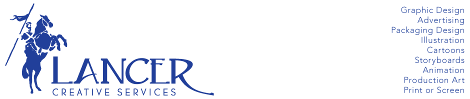
Once I had an illustration that I liked, I used the Live Trace tool in Illustrator to turn it into a vector file. A bit of tweaking and I was done.
![]()
Now to look at typefaces…..